圖像優化
圖像優化是減少表示圖像的位元組數的過程。圖像大小越小,它在頁面上加載的速度就越快。圖像大小越小,它消耗的頻寬就越少。它消耗的頻寬越少,對您的用戶來說體驗就越好,尤其是在行動網路中。
響應式圖像
Qwik 支援響應式圖像。
這是一個依賴於 vite-imagetools 模組的內建功能,因此不需要安裝額外的套件或組件。
運作方式
- 從
src資料夾導入任何圖像 - 圖像會被轉換成多個 WebP 圖像,每個斷點一個 (200px、400px、600px、800px、1200px)
- 圖像會被處理和優化以減小其大小
- 會使用
srcset屬性渲染<img>元素,以便為多個解析度設定圖像來源 - 現在瀏覽器將會根據使用的解析度載入最適合的圖像
重點
社群和 Qwik 團隊出於多種原因喜歡這個 API
- 零運行時、零 JS
- 預設情況下零屬性、簡單的 API
- 零 404、強型別 API
- 零佈局重排 (自動寬度/高度)
- 雜湊圖像、不可變快取
- 自動
.webp/.avif格式優化 - 自動產生
srcSet - 可擴展(使用任何
<img>屬性) - 預設情況下延遲載入和非同步解碼
- 輕量級,HTML 中只有一個
<img>節點
使用方法
在導入語句的末尾添加 ?jsx 後綴
import Image from '[IMAGE_PATH]?jsx';在範本中將圖像作為組件使用
<Image />結果
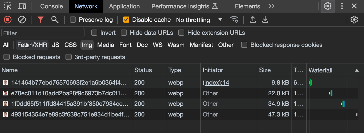
此腳本將會產生以下 <img> 元素
<img

  decoding="async"
  loading="lazy"
  srcset="
    /@imagetools/141464b77ebd76570693f2e1a6b0364f4b4feea7 200w,
    /@imagetools/e70ec011d10add2ba28f9c6973b7dc0f11894307 400w,
    /@imagetools/1f0dd65f511ffd34415a391bf350e7934ce496a1 600w,
    /@imagetools/493154354e7e89c3f639c751e934d1be4fc05827 800w,
    /@imagetools/324867f8f1af03474a17a9d19035e28a4c241aa1 1200w"
  width="1200"
  height="1200"
>**注意:**您也可以透過手動設定這些屬性的值來更改預設行為
<Image decoding="sync" loading="eager" />
感謝 srcset 屬性,瀏覽器將會根據設備的解析度載入最合適的圖像
原始來源大小為 1.5MB,但現在其大小只有幾 KB
範例
import { component$ } from '@builder.io/qwik';
import Image from '~/media/your_image.png?jsx';

export default component$(() => {
  return (
    <div>
      <Image />
    </div>
  );
});
自訂圖像 width 和 height
您可能需要為圖像設定自訂 width
<Image style={{ width: '300px'}} />但在這種情況下,您也需要手動指定 height,以避免圖像被拉伸
<Image style={{ width: '300px', height: '200px'}} />以下您可以看到一個簡單的技巧,可以避免必須手動設定 height,同時又能保持長寬比
**提示:**您應該始終指定
width和height值,以防止佈局重排
import { component$ } from '@builder.io/qwik';
import Image from '~/media/emote.png?jsx';

export default component$(() => {
  return (
    <>
      <h1>Image Example</h1>
      <div class="image-wrapper" >
        <Image />
      </div>
    </>
  );
});
.image-wrapper {
width: 300px; /* Set the desired width of the wrapper */
position: relative; /* Required for absolute positioning */
}
.image-wrapper img {
width: 100%; /* Make the image fill the width of its container */
height: auto; /* Let the browser calculate the height to maintain aspect ratio */
display: block; /* Remove any extra white space below the image */
}@unpic/qwik
- 網站上包含詳細的使用說明:@unpic/qwik
- 安裝:
npm install @unpic/qwik
Unpic 是一個第三方圖片優化函式庫,可與現有的圖片優化 CDN 搭配使用。它提供了一個可用於優化圖片的 Image 元件。
import { component$ } from '@builder.io/qwik';
import { Image } from '@unpic/qwik';

export default component$(() => {
  return (
    <Image
      src="https://cdn.shopify.com/static/sample-images/bath_grande_crop_center.jpeg"
      layout="constrained"
      width={800}
      height={600}
      alt="A lovely bath"
    />
  );
});注意:qwik-image 和 unpic 不是 CDN,不會託管您的圖片。它們與現有的圖片優化 CDN 搭配使用。我們建議使用一些熱門的 CDN:
- Cloudinary
- Cloudflare
- Bunny.net
- Vercel / Next.js
- Imgix,包含 Unsplash、DatoCMS、Sanity 和 Prismic
- Shopify
- Kontent.ai
- Builder.io
- Contentful
- Storyblok
- WordPress.com 和 Jetpack Site Accelerator
qwik-image
透過自動優化實現高效能的圖片。
npm install qwik-image
or
yarn install qwik-image
or
pnpm install qwik-image
這是一個可插拔的元件,因此開發人員可以將不同的圖片加載器連接到它(例如 builder.io 或其他 CDN)
import { $, component$ } from '@builder.io/qwik';
import {
  Image,
  type ImageTransformerProps,
  useImageProvider,
} from 'qwik-image';

export default component$(() => {
  const imageTransformer$ = $(
    ({ src, width, height }: ImageTransformerProps): string => {
      // Here you can set your favorite image loaders service
      return `https://cdn.builder.io/api/v1/${src}?height=${height}&width=${width}&format=webp&fit=fill`;
    }
  );

  // Global Provider (required)
  useImageProvider({
    // You can set this prop to overwrite default values [3840, 1920, 1280, 960, 640]
    resolutions: [640],
    imageTransformer$,
  });

  return (
    <Image
      layout="constrained"
      objectFit="fill"
      width={400}
      height={500}
      alt="Tropical paradise"
      placeholder="#e6e6e6"
      src={
        'image/assets%2FYJIGb4i01jvw0SRdL5Bt%2Fe5113e1c02db40e5bac75146fa46386f'
      }
    />
  );
});以下是 Github 儲存庫,其中包含有關使用和自訂的詳細說明:qwikifiers/qwik-image
貢獻者
感謝所有協助改進此文件貢獻者!